
When it comes to building an engaging website, a fantastic slideshow can make all the difference. But a design that looks stunning on a desktop screen might be overwhelming or slow to load on a mobile phone.
That’s where MetaSlider’s “Device” tab comes in. It gives you the power to tailor your slideshow content for different screen sizes. This allows your visitors to always have the best experience, no matter how they’re viewing your site.
Table of Contents for this post
Why Device-Specific Slides Matter
Let’s face it: mobile users don’t want to wait around for giant images to load, especially when they’re on the go. With MetaSlider, you can display a lightweight, fast-loading image on smartphones and tablets, while reserving high-resolution visuals with full captions for larger screens, such as laptops and desktops. This means your slideshows can be both performance-optimized and beautifully designed.
Device Options for Slides
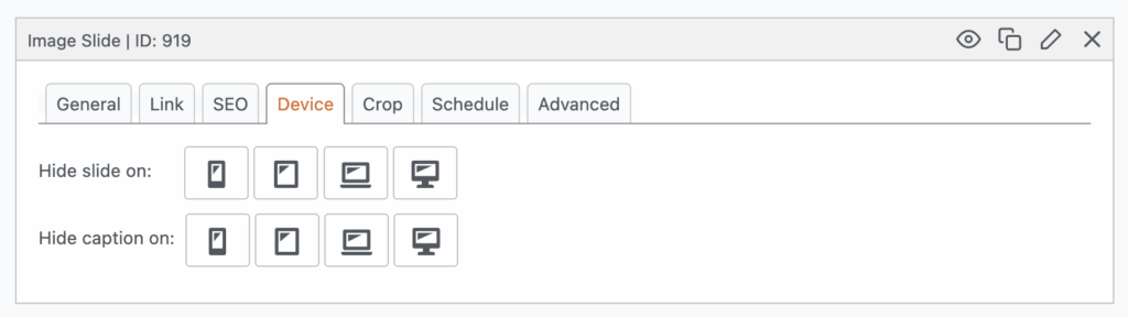
When you’re editing a slideshow in MetaSlider, you’ll notice a “Device” tab on each individual slide.
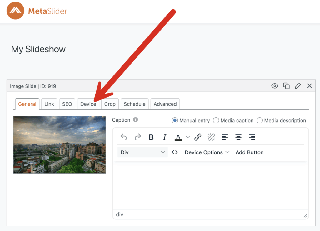
This “Device” tab lets you control which devices a slide is shown on. By default, MetaSlider offers four breakpoint options:
- Smartphone
- Tablet
- Laptop
- Desktop
Each of these icons is interactive and comes with a tooltip to guide you. For example, if you hover over the tablet icon, a message will pop up as in this screenshot:
“When enabled, this setting will hide the slide on screen widths of 768px to 1023px.”
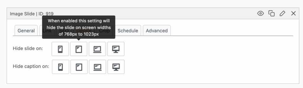
This makes it super easy to understand exactly what screen sizes your slide will or won’t appear on.
How to Customize the Breakpoints
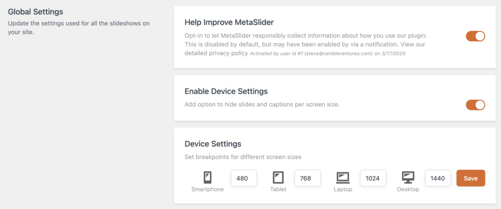
Want to fine-tune these settings even further? No problem.
Just head over to the “Settings & Help” section in MetaSlider. There, you’ll find the option to configure your own custom breakpoints. This allows you to define exactly what qualifies as a smartphone, tablet, laptop, or desktop—based on your audience’s typical devices or your site’s design strategy.
Device Options for Entire Slideshows
But MetaSlider doesn’t stop at individual slides. You can also control the visibility of the entire slideshow using the “Device Options” meta box.
Here, you can make several changes:
- Remove arrows on some screen sizes.
- Remove the navigation on some screen sizes.
- Hide the slideshow completely on specific devices.
This is perfect for situations where a slideshow might look great on a desktop but isn’t necessary, or even desirable, on a phone.
Deliver the Best Experience on Every Screen
MetaSlider’s device-specific features give you the flexibility to craft slideshows that not only look good but also work well for every user. Whether someone is swiping through your site on a smartphone or browsing on a 4K monitor, you’re in control of what they see and how they see it.
So go ahead and design with confidence, knowing your slideshow will look great on all devices.
If you want to go deeper with mobile design, you can see how to hide caption elements on screen sizes, work with Touch Swipe for mobile devices, and even have different slideshows for different screen sizes.
Get the best WordPress slideshow plugin
MetaSlider Slideshow is the best WordPress slider plugin.
You can show create stylish sliders using images, videos and more.