MetaSlider has a “Device” tab that allows you to show different slides to different screen sizes.
MetaSlider users rely on this feature so that they can customize their slideshows for different devices. For example, on a mobile phone you can show a styling fast-loading image with no caption. But on a large desktop screen you can show a large, high-resolution image with a caption.
Device Options for Slides #
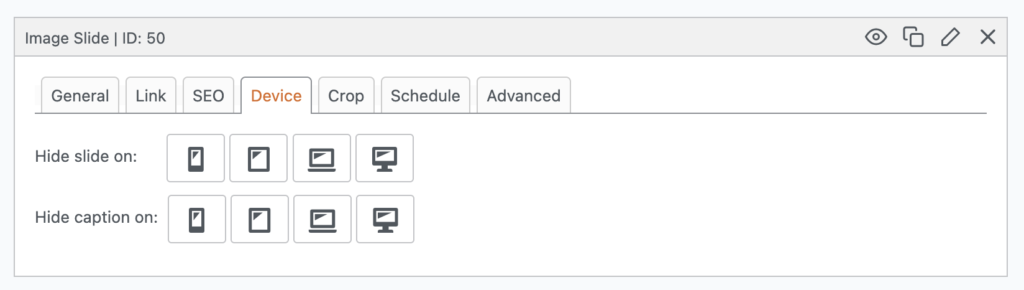
In the MetaSlider slideshow editing area, you’ll see a “Device” tab. Here you can choose to hide your slides on some device sizes. We provide four breakpoints by default:
- smartphone
- tablet
- laptop
- desktop
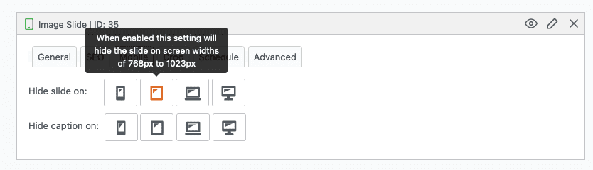
Each icon has a tooltip with details of what this option does. For example, if you click the tablet icon, you’ll see the message, “When enabled this setting will hide the slide on screen widths of 768px to 1023px”.
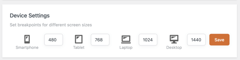
Configure the Breakpoints #
If you want to configure these settings, go to the “Settings & Help” area. You will see the option to choose the breakpoints for the different device sizes.
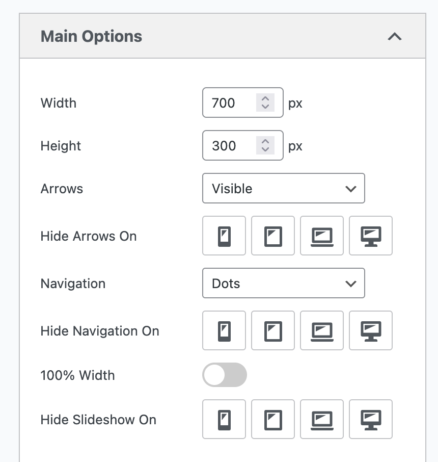
Device Options for Slideshows #
In the MetaSlider slideshow editing area, you’ll now see a “Device Options” tab. Here you can choose to hide your slideshow’s arrows and navigation on some device sizes. You can also choose to hide the entire slideshow on some device sizes.