
This post is about a release of the MetaSlider Gallery plugin. This is the quickest, easiest, and most stylish way to add a photo gallery to your WordPress site.
MetaSlider Gallery 2.37.0 is a substantial update for anyone building image-heavy WordPress galleries.
The headline feature is a new “Load More” option, so you can reveal images in batches instead of loading everything at once. This release also gives you more control over image ordering and sizing, responsive layouts, and caption styling.
Table of Contents
Load More button for large galleries
Galleries using Grid, Masonry, and Justified layouts can now reveal images in configurable batches. In the right sidebar, you can choose how many images appear at a time. In the example below, the setting is 4 images, so each click of the “Load More” button reveals 4 more.
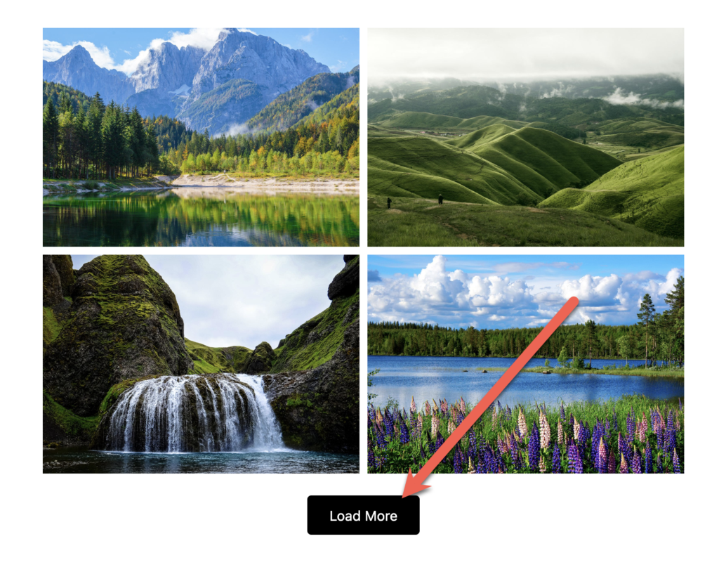
Here’s a video guide to this new “Load More” feature:
Automatic image ordering
You can sort images by newest, oldest, filename A to Z, filename Z to A, or random order instead of relying only on drag-and-drop.
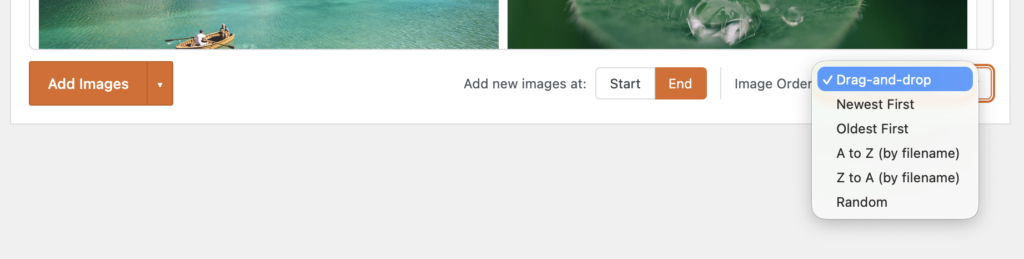
This video explains how the ordering feature works:
Separate gallery and window image sizes
You can now have different size options for your images when they are in posts and when they’re in the main gallery window. You can control this using the new “Gallery Image Size” and “Window Image Size” settings.
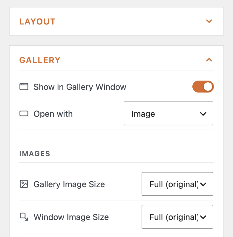
Here’s a video guide to using the gallery window:
More responsive column controls
This version of MetaSlider Gallery has new laptop and tablet column settings. This matches the approach used in MetaSlider Slideshow.
Your gallery layouts can now be customized for mobile, tablet, laptop, and desktop views. In the screenshot below, we’re using 4 columns for desktop displays, 2 columns for laptop and tablet displays, plus 1 column for mobile.
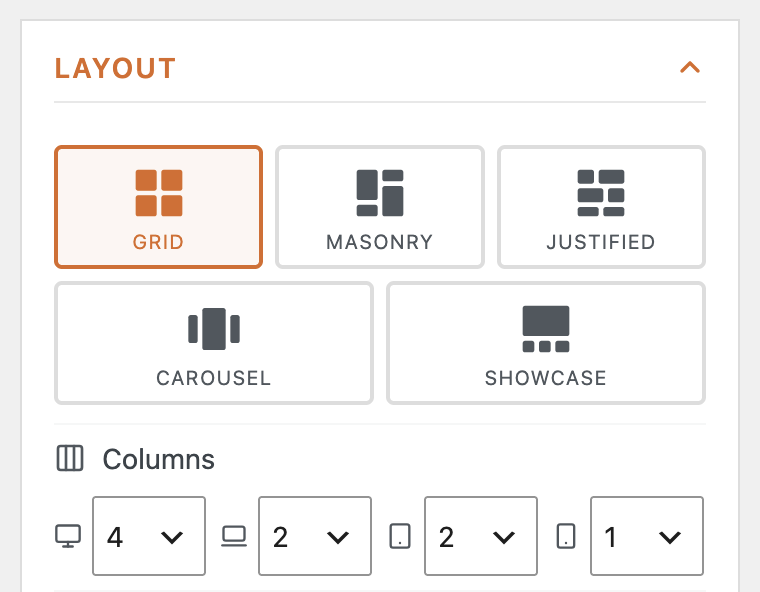
This video explains how to use those different layouts on different device sizes:
More flexible captions
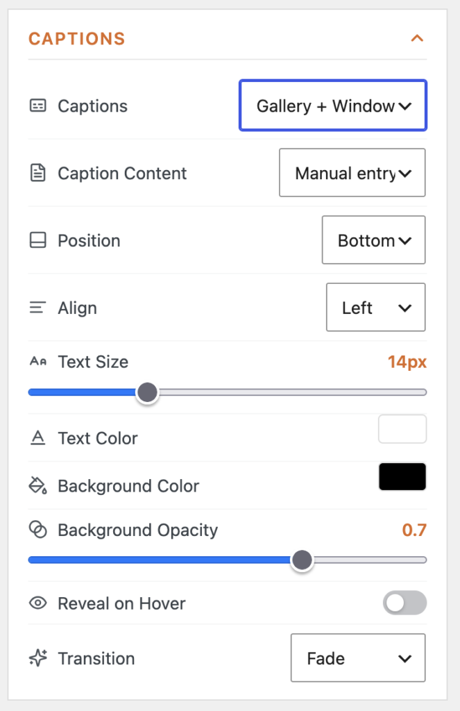
MetaSlider Gallery now gives you more control over captions, including position, alignment, background opacity, and more.
Other improvements and fixes
This release also includes several editor and display refinements. Carousel and Showcase previews now size to the gallery instead of being cut off, caption link options are visible again in the caption editor, and unsaved galleries no longer show a blank white area when switching from Arrange to Preview.
Image quality has also been improved: choosing the Full image size now serves the original image instead of being overridden by the responsive srcset behavior that could make images look blurry on first view.
For developers
Gallery lightbox settings are now registered through the metaslider_default_parameters filter, making those defaults easier to manage alongside other MetaSlider parameters.
This post provides an overview of the new features in this release of the MetaSlider Gallery plugin. The complete changelogs for both Free and Pro versions are available in our Docs area.

Get the best WordPress gallery plugin
MetaSlider Gallery is the best WordPress gallery plugin.
You can show WordPress images, videos, and slideshows in a stylish gallery.