WordPress really introduced many people to a new image feature called “Duotone filters”. This feature is now very prominent when you add images in the block editor.
In this guide, we’ll introduce you to Duotone images and how to use them in WordPress.
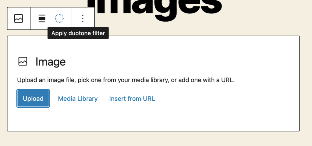
In previous versions of WordPress, the Duotone icon was a dashed circle. This icon was in an important place, but I think the design of the icon was too subtle and it was easy to miss. You can see the old icon in the screenshot below.
The screenshot below shows new icon which arrived in WordPress 6.1. The black and white triangle icon has the Duotone filter option. This icon design is more prominent and is being noticed by more users.
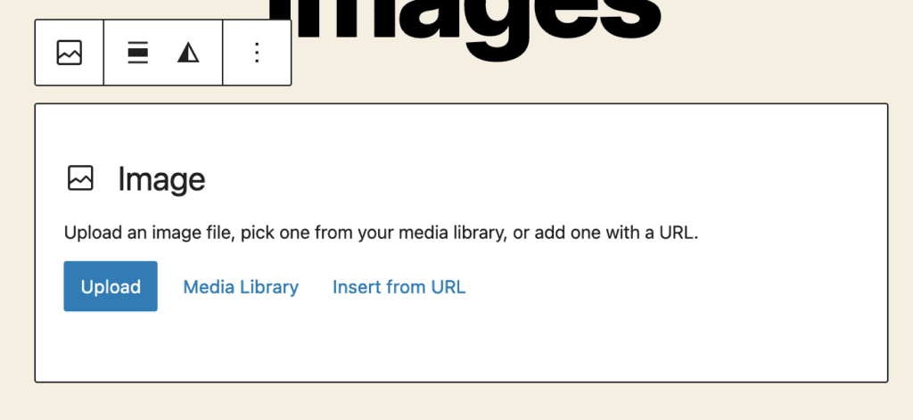
Table of Contents for this post
What are Duotone images?
“Duotone” means “two colors”. There are alternative options available for designers such as “Tritone” (three colors) and “Quadtone” (four colors), but those aren’t available with the WordPress core.
Duotone images use two colors to create a gradient effect. This technique can add a unique, artistic flair to an image and can be used to create a vintage or retro look.
The two colors used in a duotone image are typically chosen to complement each other, such as blue and orange or red and green. One color is chosen for the shadows in the image, and the other is chosen for the highlights. Duotone images look best when there’s a stark contrast between the shadows and highlights.
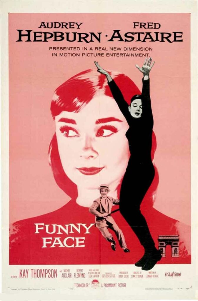
Previously, Duotone images could be created using image editing software, such as Adobe Photoshop or Illustrator. Now you can do it using the WordPress core. Duotone images are often used in movie posters, graphic design, marketing materials, and as decorative elements on websites and social media. Designers often use Duotone images for background images, as in this Audrey Hepburn movie poster:
How to use the WordPress Duotone filters
Let’s see how WordPress Duotone filters work. For the first example, I’ll use an image of fruit that I’ve uploaded to WordPress.
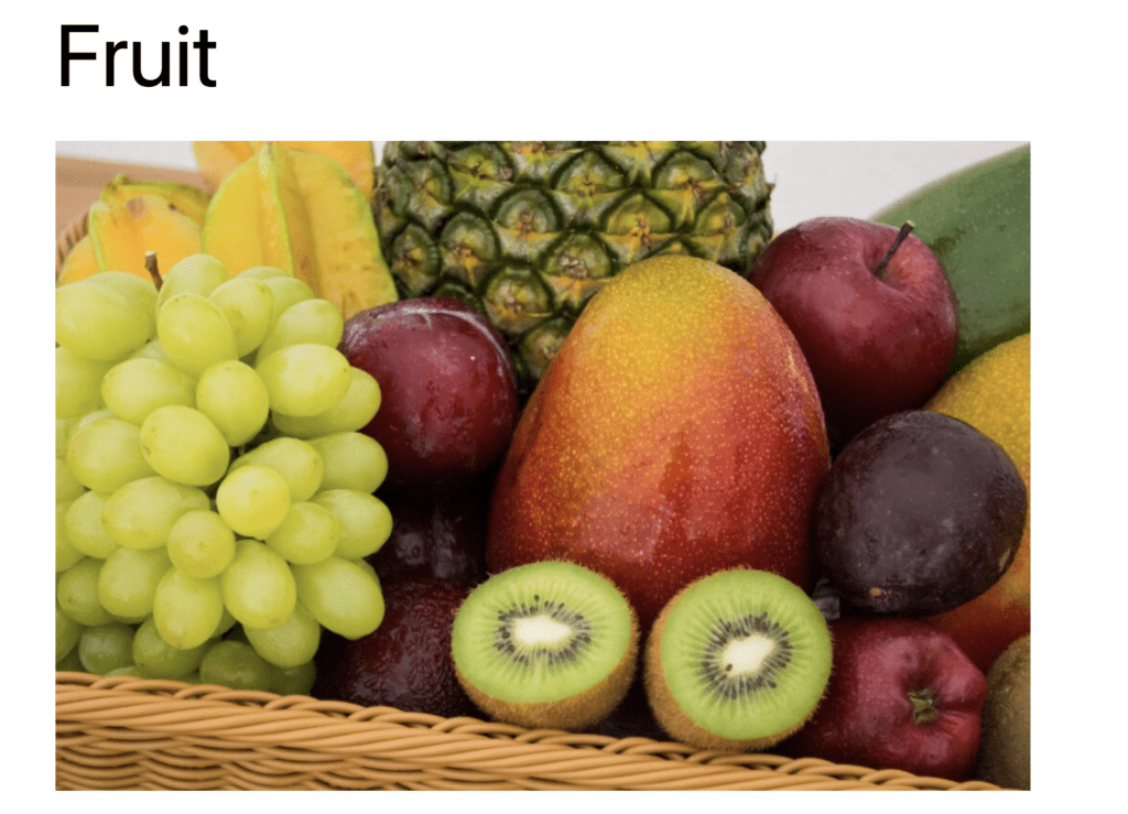
In this screenshot, you can see eight different Duotone options:
- Dark grayscale
- Grayscale
- Purple and yellow
- Blue and red
- Midnight
- Magenta and yellow
- Purple and green
- Blue and orange
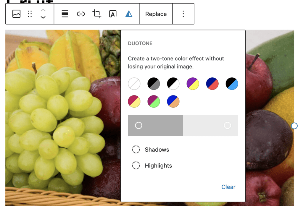
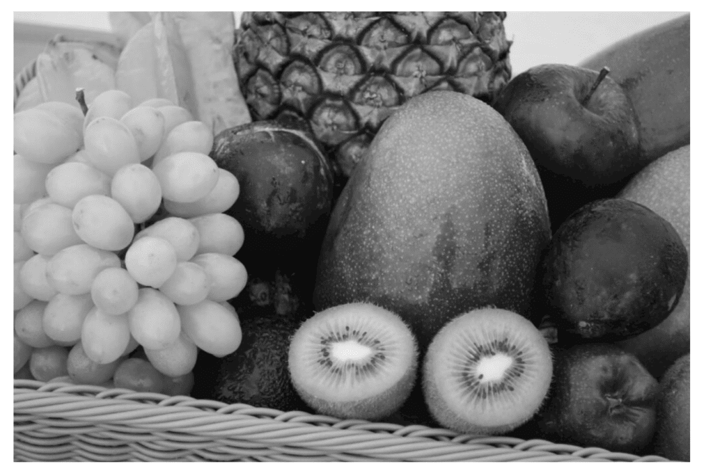
If you click any of these options, your image will immediately change color. This screenshot below is the fruit image with the “Grayscale” Duotone option:
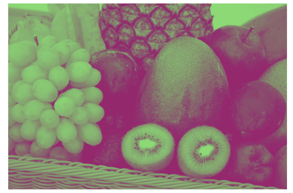
This next screenshot shows the fruit image with the “Purple and green” Duotone option:
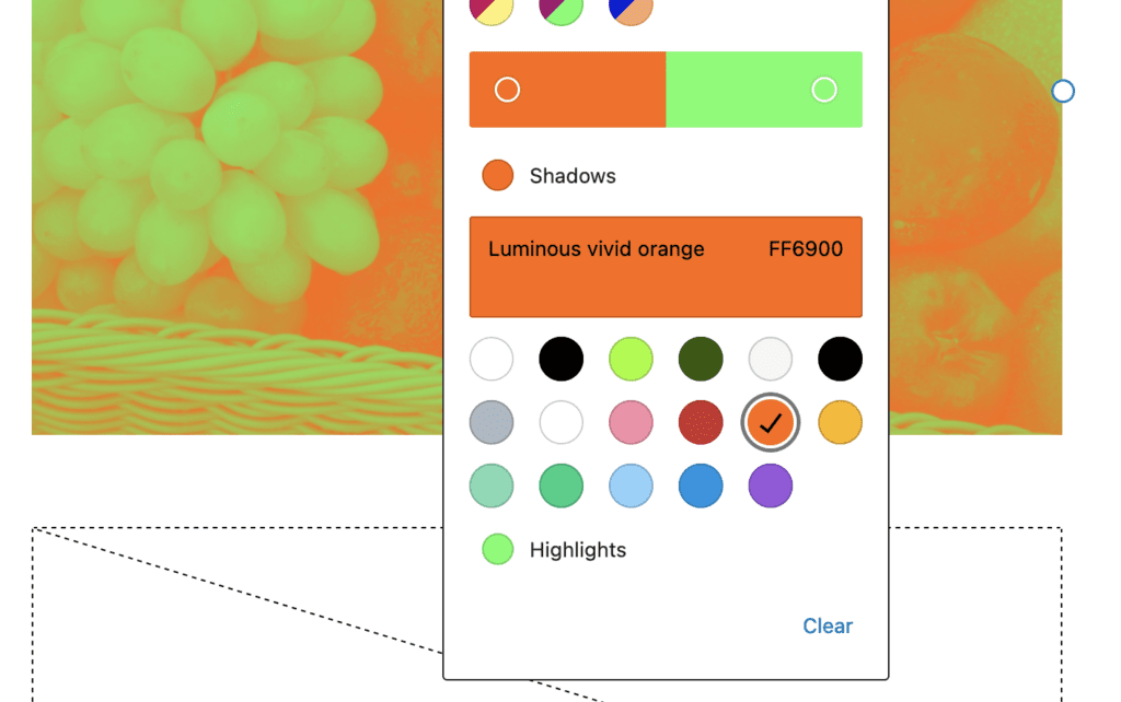
It’s also possible to choose your own color patterns. You can click on the “Shadows” or “Highlights” option to customize the colors.
You may look at these images and wonder how useful this approach can be. My advice is to consider using them as background images. For example, adding text over the image is a great way to break up your text and make a visual impact.

As I mentioned in the introduction earlier, Duotone images will look best if there’s a strong contrast between the shadows and the highlights. Unlike the fruit image in our first example, this next image has a clear distinction between light and shadow.
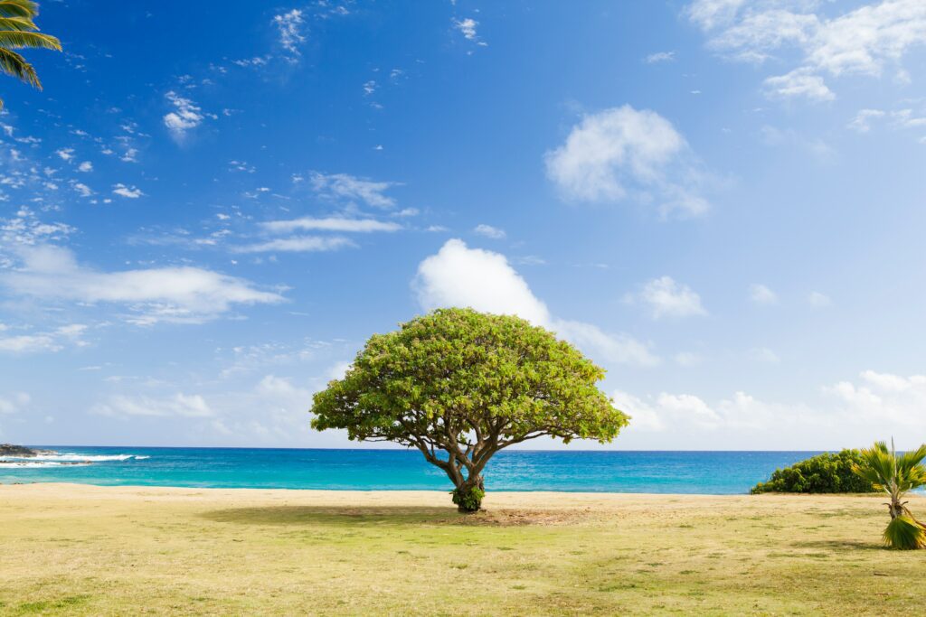
This final screenshot shows the tree and beach image with the “Grayscale” filter. Because of the added contrast, it’s easier to see the image and text than it was with the earlier example using fruit.

Duotone Filter Summary
The block editor has introduced nice improvements such as duotone filters and aspect ratios, but there’s room for more. We’re likely to see major improvements to the Media Library with Gutenberg Phase 3.
