WordPress 6.3 introduced an important change to how you add images to WordPress.
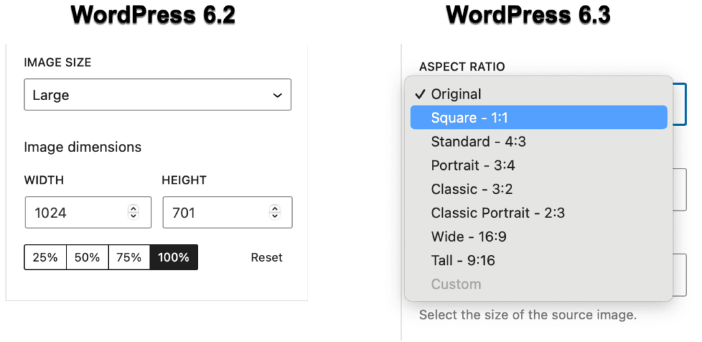
If you’re using the block editor, you are now able to choose aspect ratios for your images. This screenshot below shows the previous image block on the left, and the new block on the right. There are now seven different aspect ratios that are available to you.
Here are the seven different aspect ratios. You can also choose “Original” to show the original image or “Custom” to choose a custom aspect ration.
1:1 (called “Square”)
4:3 (called “Standard”)
3:4 (called “Portrait”)
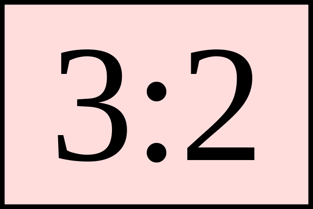
3:2 (called “Classic”)
2:3 (called “Classic Portrait”)
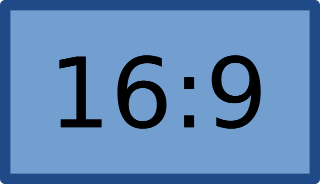
16:9 (called “Wide”)
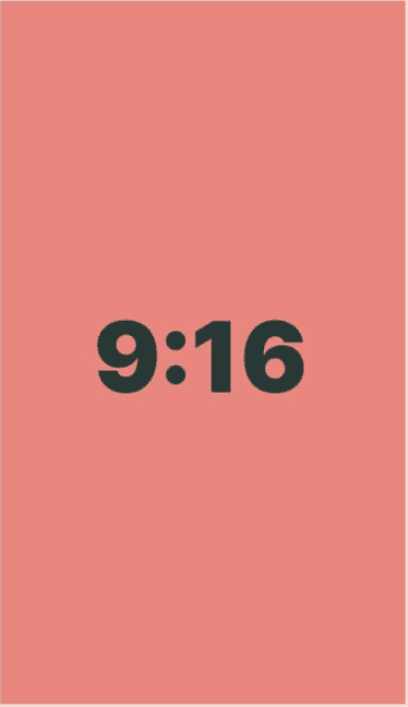
9:16 (called “Tall”)
These aspect ratios are available for several of the image blocks in WordPress:
The simple version is that an aspect ratio describes an image’s shape.
If you have multiple images with different dimensions, you can use aspect ratios to choose the same size for all of them
Aspect ratios are written as a formula of width to height. A common example is 3:2, which creates a photo with a width 1.5 times larger than the height.
For example, we often recommend that MetaSlider slides are 16:9 because that is a really good aspect ratio for slideshows. The image could be 1600px × 900px, or 3200px × 1800px, and the aspect ratio would still be 16:9.
An alternative example is the opposite aspect ratio: 9:16. This is common with Instagram videos and YouTube Shorts. The image could be 900px × 1600px, or 1800px × 3200px, and the aspect ratio would still be 9:16.
Why is WordPress using Aspect Ratios?
You can read the full discussion and the thoughts of the developers by clicking this Github link. The key benefit of aspect ratios is given in the very first post:
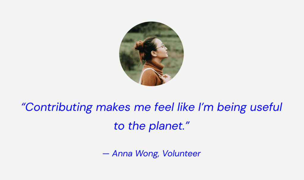
“Many pattern designs rely on a specific dimension of an image in order to provide a compelling example. For example this circular avatar pattern … At the moment, if you mean to update this person with a photo of your own, unless you replace it with a new image of the same dimensions and crop, the pattern will be broken.”
This is the ideal use-case for aspect ratios. The main advantages are when you’re replacing images or want consistency. Previously, replacing one image with another required both images to be of the same size. However, if you’re using aspect ratios, you can simply exchange one image for another.
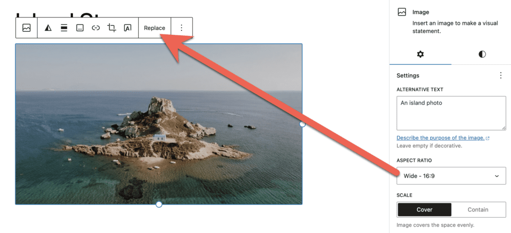
Let’s see an example. In this screenshot, I have a horizontal image and I’ve set the aspect ratio to be 16:9.
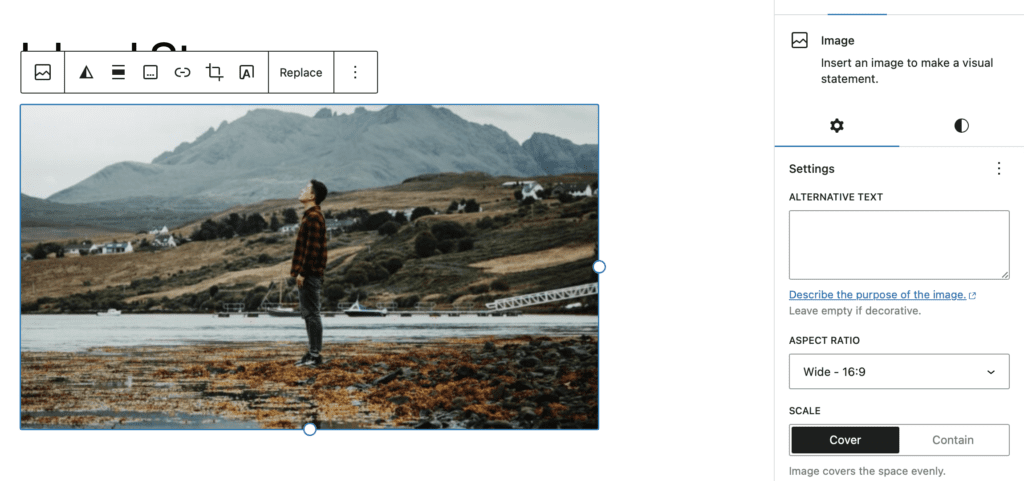
Now I’m going to click “Replace” and upload this next image, which is vertically orientated:
Even though I’m replacing the old image with a very different new image, the end result is very similar. The new image automatically uses the new aspect ratio. The top and bottom of the image are not shown in order to preserve the 16:9 aspect ratio.
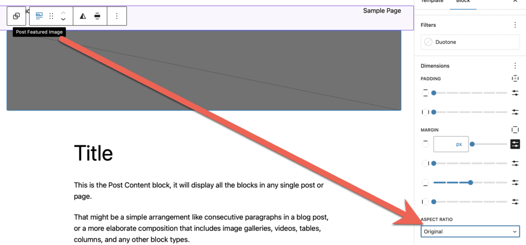
One very practical use for this feature is the “Post Featured Image” block. There are plugins that allow you to set a height and width for featured images, but aspect ratios are a good alternative. When you add this block to a post or a template, you can choose an aspect ratio for the block. This means you will get a consistent layout for your featured images, no matter what image your users upload. This screenshot below shows the “Post Featured Image” block in the “Site Editor” area of WordPress. Whatever aspect ratio I choose here will apply to all the featured images for all my posts: