
Slideshows are a powerful way to grab attention. They highlight your best content, showcase images, and guide visitors to important pages. But sometimes a standard slider isn’t enough. You may want a slideshow that stretches across the entire screen for a more immersive look.
That’s where MetaSlider’s Full Width feature comes in.
In this guide, we’ll explain what full-width slideshows are, how they work in MetaSlider, and when to use them. By the end, you’ll be ready to create sliders that span the entire browser window.
Table of Contents for this post
What Is a Full-Width Slideshow?
A full-width slideshow stretches from one side of the browser window to the other. You can see an example in this screenshot below:
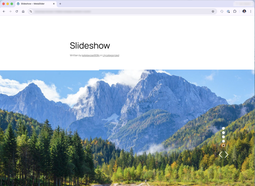
Instead of sitting inside a narrow content area, the slider fills the entire width of the page. This creates a modern, visually striking design that works well for:
- Homepage hero sections
- Product highlights
- Portfolio showcases
- Landing pages
- Announcements and promotions
Many modern websites use full-width sliders at the top of the page because they immediately catch the visitor’s eye.
With MetaSlider, you can easily create this effect using built-in width settings.
Understanding MetaSlider’s Full-Width Options
MetaSlider provides two main width settings that control how your slideshow behaves. You can see them in this next screenshot: “100% Width” and “Adjust Width to Target Element”.
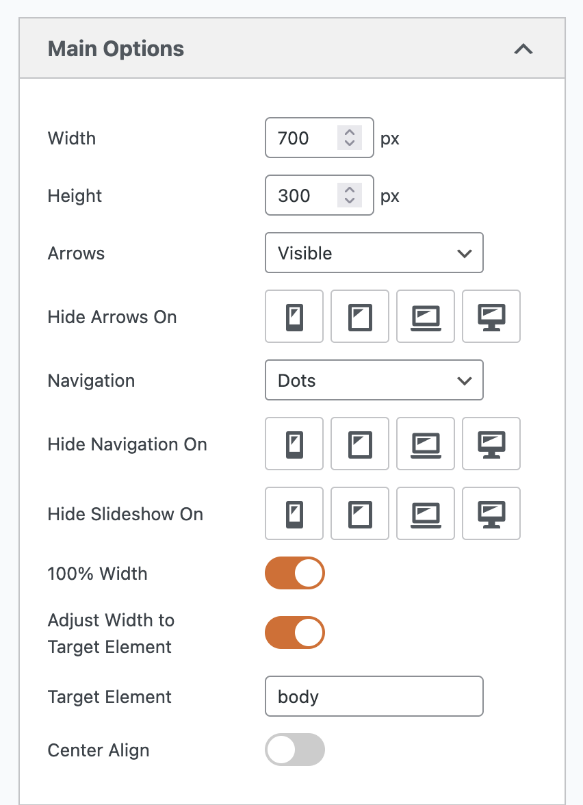
100% Width
This is the default setting in MetaSlider.
When enabled, the slideshow fills the entire width of the container where it is placed.
For example:
- If you insert the slider into a blog post, it will fill the width of the post area.
- If the post content is narrow, the slider will also appear narrow.
In other words, the slider expands to the full width of the space available to it, but not beyond that space. This option works well when you want the slider to stay aligned with your page content.
Adjust Width to Target Element
The Adjust Width to Target Element option gives you more control.
This setting forces the slideshow to match the width of another element on the page.
By default, MetaSlider uses the “body” element as the target. For most WordPress themes, this means the slideshow will expand to the full width of the browser window. You can change the “body” option if your theme works differently.
Once this setting is enabled, your slider is no longer restricted by the width of the post or content area. Instead, it stretches across the screen.
The result is a true full-width slideshow.
Before and After: What Changes?
To understand the difference, let’s show a slideshow before and after the Adjust Width to Target Element option is enabed.
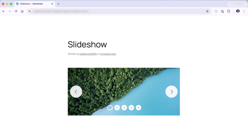
Before
With only 100% Width enabled:
- The slideshow sits inside the post content area.
- It expands to fill the width of the post.
- But the post itself is inside a central container.
The slider appears relatively narrow because it is limited by the content layout.
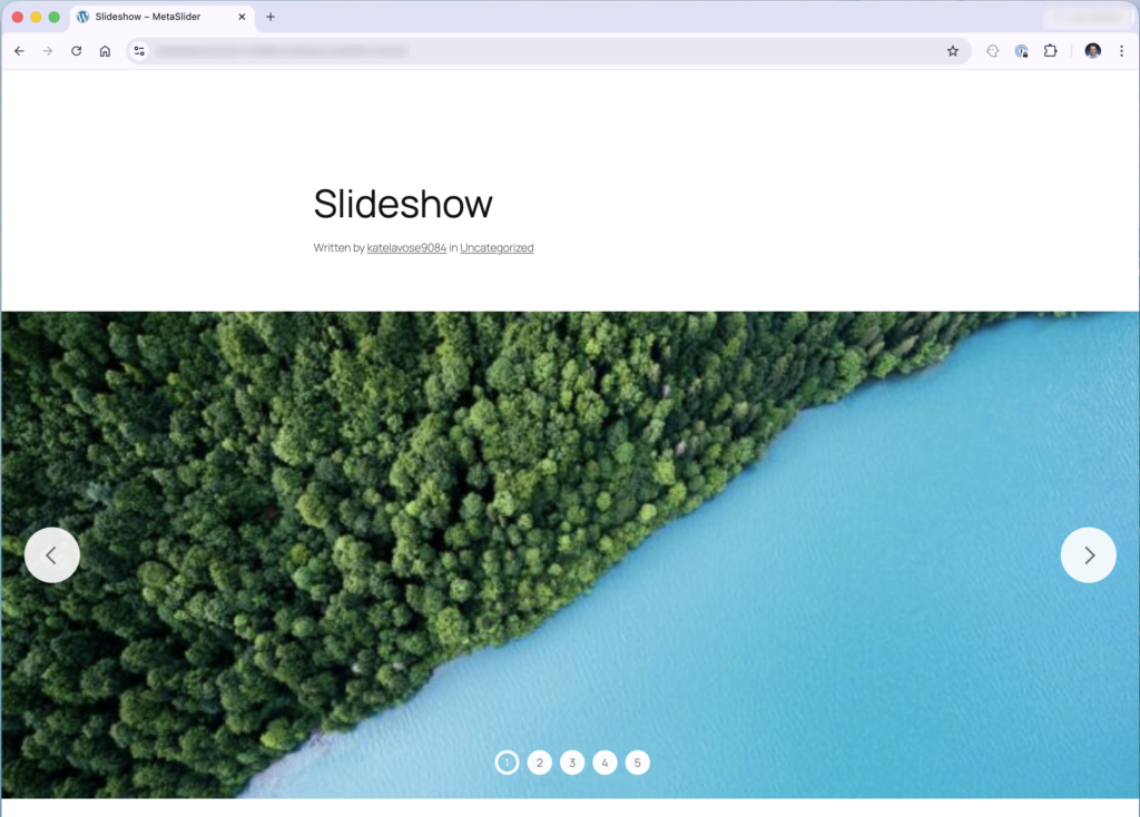
After
When Adjust Width to Target Element is also enabled:
- The slideshow expands to match the width of the body.
- It stretches across the entire browser window.
- The slider now reaches from one side of the screen to the other.
This creates the dramatic full-width effect many websites use for hero sections.
Why Your Theme Matters
WordPress themes play a big role in whether a full-width slider works correctly.
Many themes organize page layouts using containers. A container is simply a section that limits how wide content can appear.
Typically, themes have:
- A central content container for posts and pages
- Wider areas for headers, banners, or hero sections
If you insert MetaSlider into a post or page, the slider will usually stay inside the central content container.
This container often has a fixed width, which prevents the slider from expanding across the screen.
The Best Place for a Full-Width Slider
For a true full-width layout, your slider should ideally be placed in a theme area designed for wide content.
Examples include:
- A homepage hero section
- A header banner area
- A homepage slider section
- A template block above the main content
In many themes, these areas sit outside the main content container. That allows the slider to stretch across the full screen.
If your theme includes a dedicated “slider area”, that’s usually the perfect place to add your MetaSlider slideshow.
A Simple Rule to Remember
Here’s a helpful guideline when creating full-width slideshows:
If the container is narrow, the slider will be narrow as well.
To achieve a full-width effect:
- Enable Adjust Width to Target Element in MetaSlider.
- Place the slider in a full-width theme section instead of a standard post or page.
When both conditions are met, your slideshow should span the entire browser window.
When to Use Full-Width Slideshows
Full-width sliders work especially well when you want to create strong visual impact.
Here are some common use cases:
- Homepage Hero Sections: Display large images, headlines, and calls-to-action at the top of your site.
- Product Promotions: Showcase featured products across the full screen to attract attention.
- Photography or Portfolio Sites: Large slides allow images to shine without being restricted by narrow layouts.
- Landing Pages: Full-width sliders help guide visitors toward key messages or offers.
Try the Full-Width Feature in MetaSlider
Creating a full-width slideshow in MetaSlider is simple once you understand how layout containers work.
Just remember:
- 100% Width fills the container your slider is placed in.
- Adjust Width to Target Element allows the slider to expand across the page.
- Your WordPress theme layout determines how wide the slider can actually appear.
Experiment with these settings and try placing your slider in different areas of your theme. With the right setup, you can create stunning full-width sliders that instantly capture your visitors’ attention.
Ready to give it a try? Open MetaSlider and experiment with the Full Width settings to see how easily you can transform your slideshow layout.
Get the best WordPress slideshow plugin
MetaSlider Slideshow is the best WordPress slider plugin.
You can show create stylish sliders using images, videos and more.