We had a question from a MetaSlider user who wanted to build a slideshow that uses the full height and width of the screen.
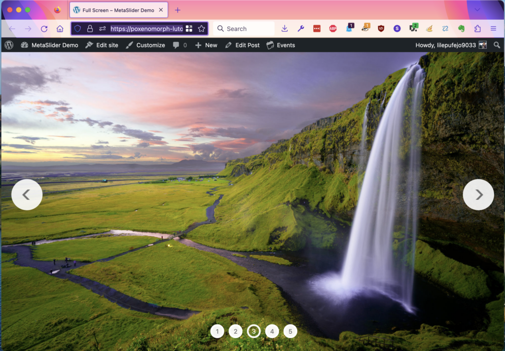
In the image below, you can see that the slideshow works as normal with Previous and Next arrows, navigation, and more. However, the slideshow is the only thing visible on the screen.
Follow this guide, and we’ll show how to build a full-screen slideshow like this on your site.

First, create a slideshow using MetaSlider. In this example, we’ll use an image slideshow.
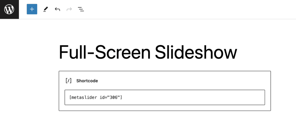
Second, add your slideshow to a post or page. You can use any method you want, from a Gutenberg block to a shortcode. In this example below, I’ve added the shortcode inside a WordPress post:

The third and final step is the CSS. Add the code below to your site. You can use any of these techniques to add the CSS. The only thing you will need to change is the number “306”. Update that number in the code below to match the ID of your slideshow.
Please note that this code is designed for each image or video to take the full width of the screen. You may need to make an adjustment to the CSS below if you’re showing multiple images on the screen at one time in a carousel effect. The CSS may also need changes if your slideshow’s navigation takes up a portion of the theme, such as thumbnails or filmstrip.
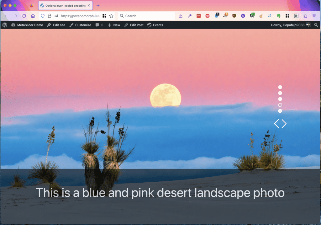
However, despite those caveats, your full-screen slideshows should have all the normal MetaSlider features. This example below uses the “Jenga” theme with vertical navigation, plus a large caption strip at the bottom of each image.

